So You Want to Make a Digital Humanities Website
Part Four: Sketching a Homepage
Part One / Part Two / Part Three / Part Four / Part Five / Part Six
Now that we have an idea of what the structure of the site will look like, let’s work on the first thing your audience will ever see of your project: the homepage. The homepage is a vital part of engaging with your audience and sets the tone of the rest of their experience. Starting your design process here also allows you to define the tone and style of the rest of the website for yourself.
The Goals of a Homepage
There are a few things you should keep in mind when designing a homepage. Look back at your answers in Part One to get an idea of where to start.
The Number One Goal: Tell the user what this site is all about!
"If the site does not do a good job of answering [this question] within a few seconds, the user will feel dumb, leave, and never come back." - A List Apart
Describe your project as simply and concisely as possible so the user knows exactly what they’re in for as soon as they’ve landed on your homepage. Many times I find myself clicking the About link just to figure out what exactly the project is about in the first place. Try to avoid this! You want the user to click About because they want to know more not because they want to know something.
Structure: Form Follows Function
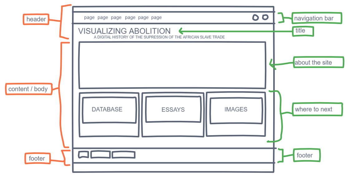
Most pages have the same basic structure: header –> body or content –> footer. This helps a user who is unfamiliar with the site navigate easily even on their first visit.
As the eye moves down the page, information becomes more and more specialized and directs the user to their next step. You can play around with how the body of your homepage is structured but for most sites, especially academic oriented sites, the header and footer must stay simple and straight forward. Don’t make the user hunt down the navigation bar or the title of the site. The body is reserved for a short description, representative images, and emphasizing top-level pages. You can have more stylistic freedom here as this is where the spirit of the site is first expressed. Finally, the footer usually holds abridged copyright, sponsor, and contact information.
Here are a few prompts to get you started thinking about the structure and content of your homepage:
- What is the first thing you want the user to know about your site?
- Where should the user go next, ideally? Are there top-level pages you want to single out even more?
- Are there quotes, images, or videos that summarize the project that you would like to showcase on the homepage?
Style: The Artistic Eye
How will you express the tone of your site visually?
-
Color
-
Fonts
Some Examples
Take a look at each of these DH homepages and analyze what works and what doesn’t. Look at other sites, both DH projects and otherwise to find inspiration. Take note of how images, fonts, and colors are used, how simple or complex the page looks, and what top-level pages are emphasized and how they are emphasized. You don’t have to reinvent the wheel. Common elements such a typeface, color, and layout are common because they work!
To be continued . . . The Australian Newspaper Fiction Database
The title of this site gives us a good idea of what’s in store, combined with a slideshow of large illustrations from the database, gives us a feel for the tone of the site. It’s a light-hearted project, focusing on popular fiction of the past. I would prefer there be a short blurb expanding on the project’s goal or purpose or what the user can do on the site. The database and getting involved are the top-level pages that are emphasized through separate orange buttons.
What America Ate: Preserving America’s Culinary History from the Great Depression
I adore this homepage. It is bright, engaging, and simple. It sets the tone nicely, utilizing a similar approach to the previous homepage. We have a large illustration from the source material that emphasizes the aesthetics of the time period and the subject matter: food. This page also gives us a blurb that expands on what the project is all about before giving us an expanded description that encourages us to scroll further. The homepage is set up similarly to a one page website, as we scroll, new sections are emphasized. In this way, top-level pages are showcased on the homepage. What America Ate encourages the user to take their next step towards Recipe Transcription, the Map, and Browse which itself emphasizes certain categories.
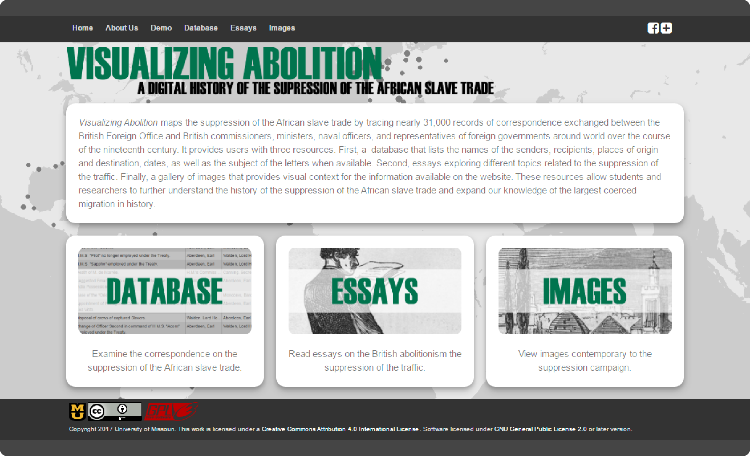
Visualizing Abolition
When going into designing Visualizing Abolition’s homepage, I wanted to create an understated aesthetic in keeping with the tone of the content being presented. Our project is also made up of three important components which needed to be highlighted on the homepage that would allow the user to choose their next step depending on how they learn and make sense of information.
How to Design Your Own
- Make a free account
- New freehand
Wix’s Guide for Killer Homepage Design
More Inspiration
- Chirila: A database of the languages of Australia
- Quiapography
- Renewing Inequality: Urban Renewal, Family Displacements, and Race 1955-1966
- Illuminating Livingstone
- In the Spotlight
On to Part Five: Building Your First Github Site
The next two sections are currently under construction. For a brief overview of creating your first github site go to Part Five, for a frequently updated list of resources head over to Part Six.


